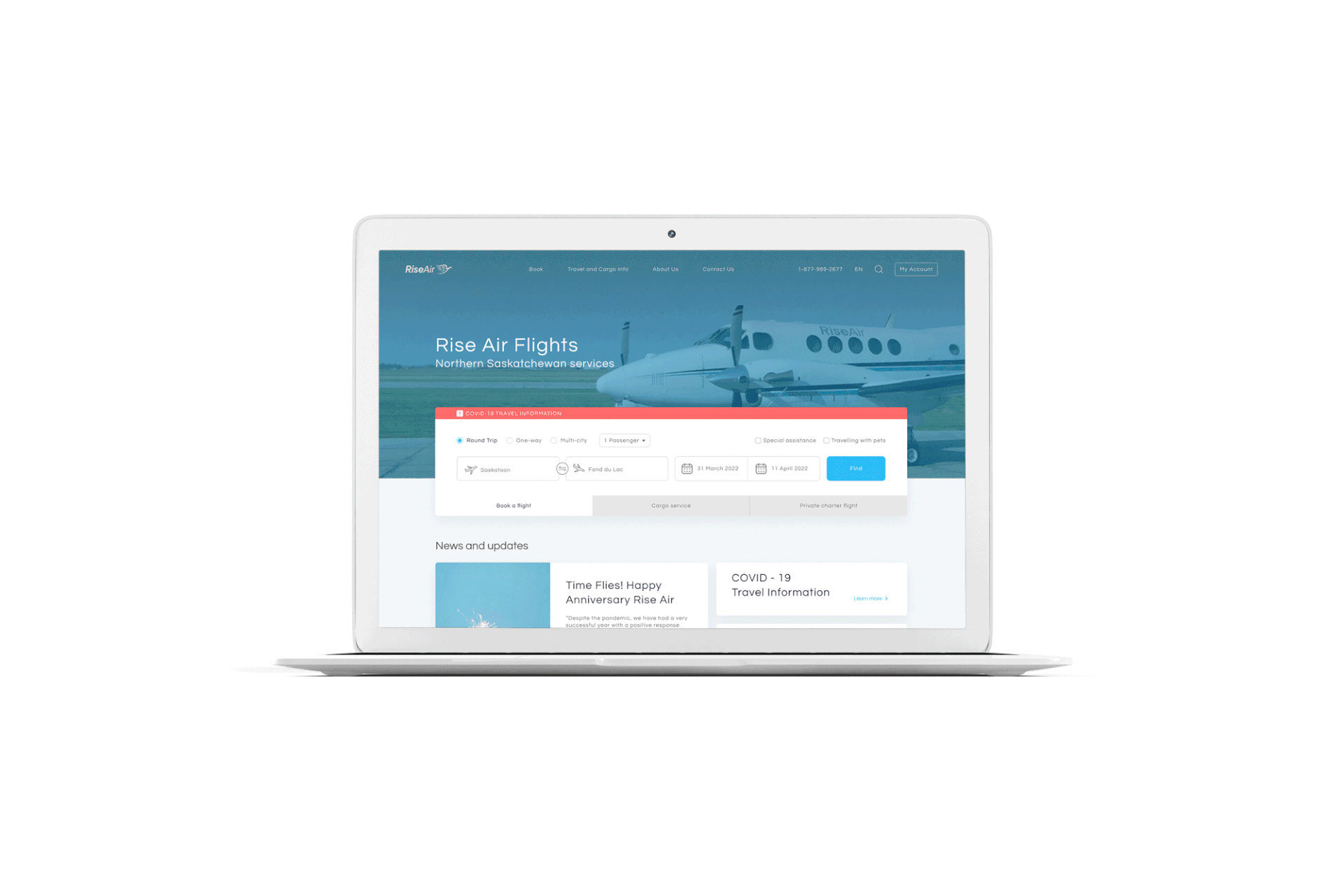
Overview:
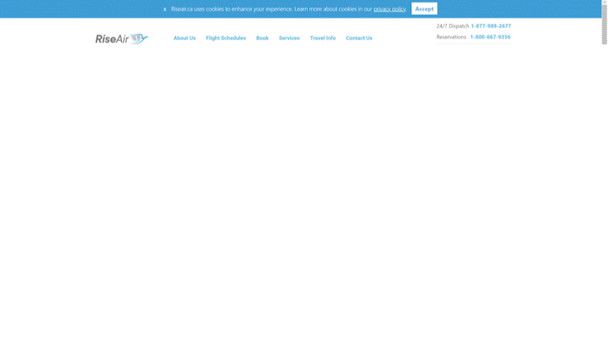
Rise Air is a Saskatchewan-owned and operated airline with the capability of moving people and goods to and from virtually any location in the province and beyond.
This is a project made to evaluate the online experience of the Rise Air website, detect its problems, and through research and redesign the User Interface.
Problem:
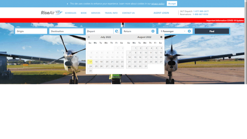
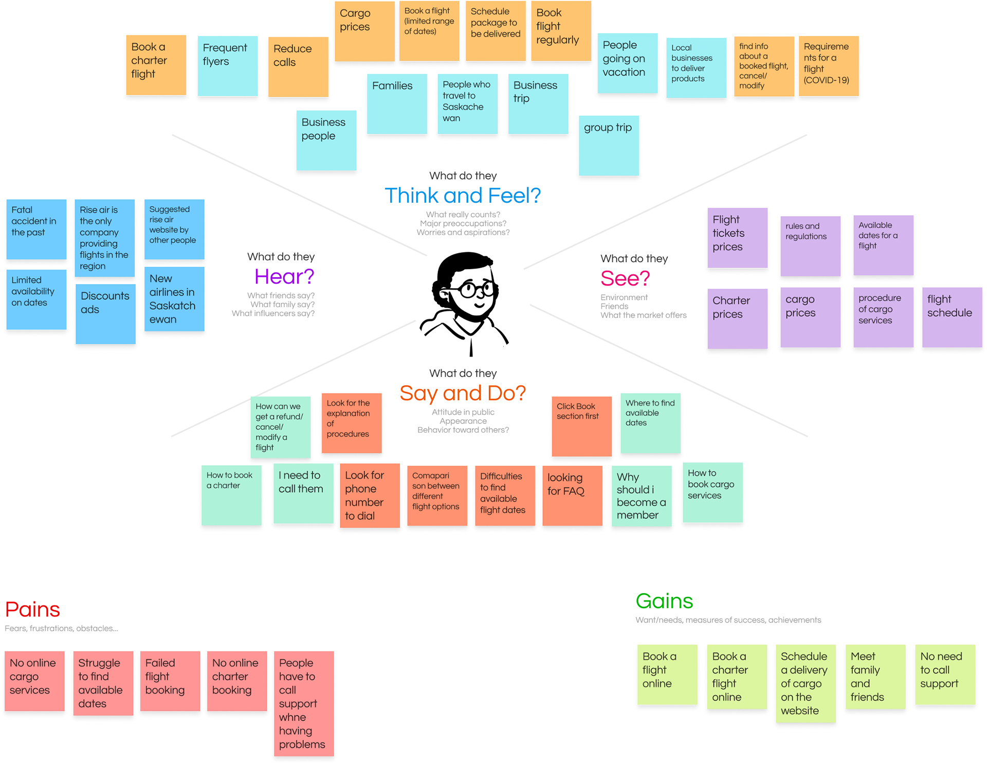
Users were frustrated in booking a scheduled flight due to the available dates to select, they didn’t have a clear understanding of the process to book a charter or a cargo service.
Solutions:
Re-design the website based on our user research and analysis.
6 major issues
The arrangement of categories in top bar is different from homepage
Don’t know where to type in the number of infants and buy a one way ticket.
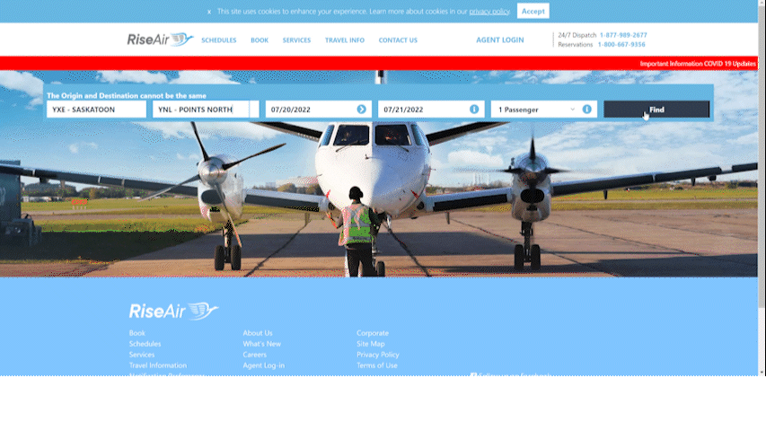
Users will be redirected to previous page to try different dates to find available flight
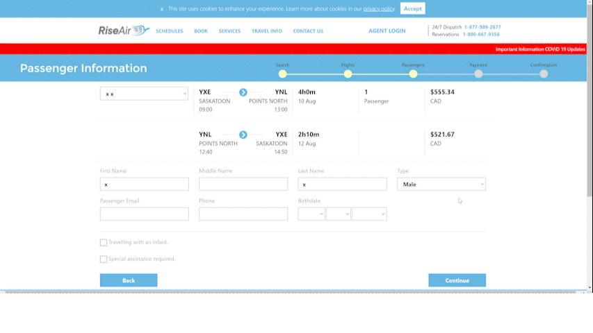
User is able to proceed even with wrong information
No information to understand why the payment was not placed.
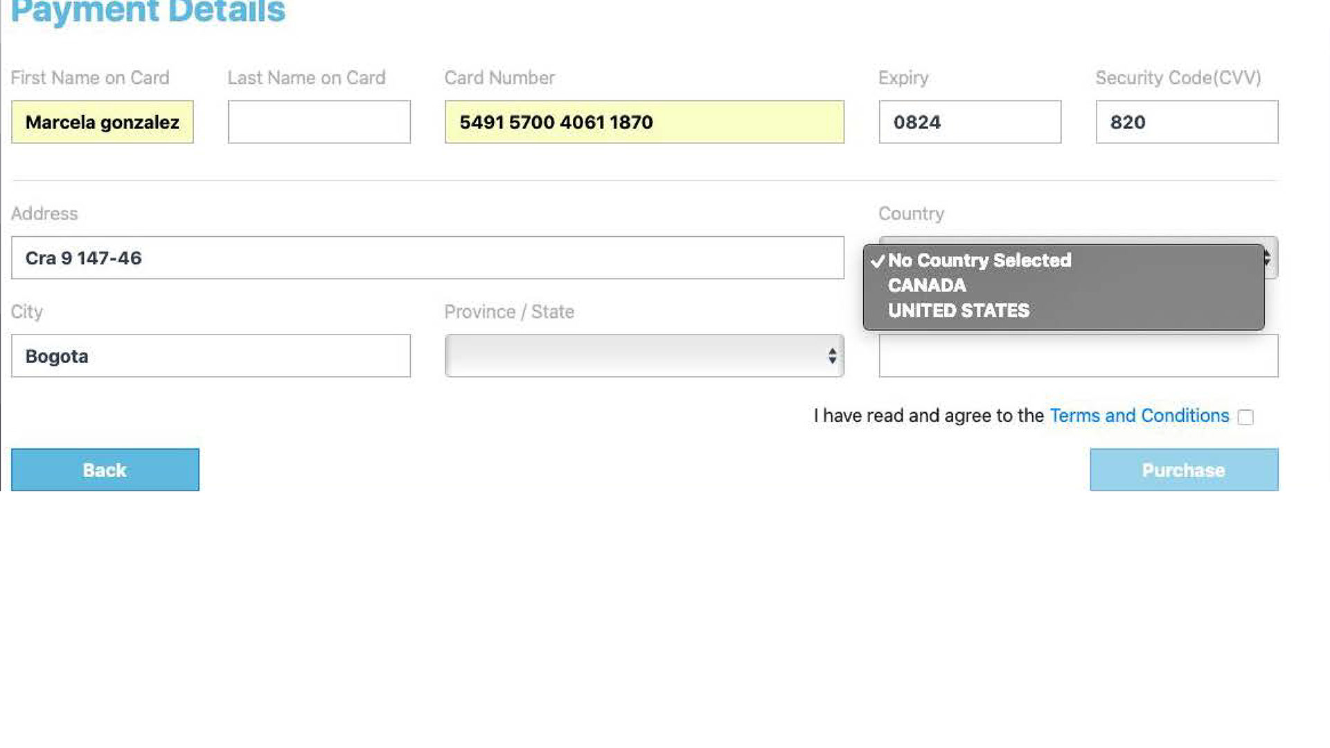
Only USA or Canadian credit cards can be used
6 key findings
1. Available scheduled flight dates
No error prevention to booking a scheduled flight according to the available dates.
2. The unclear process to book a charter flight
Unknown charter concept, unlike quote form, no booking section for charter.
3. Lack of visibility of process to book a cargo service
Information about the service is unfound by the users, unclear contact numbers, and no booking section for cargo.
4. Navigation issues
Breadcrumbs, back button, shortcuts (icons, map, logo), drop-down menu (cities, purchasing)
5. Cluttered information
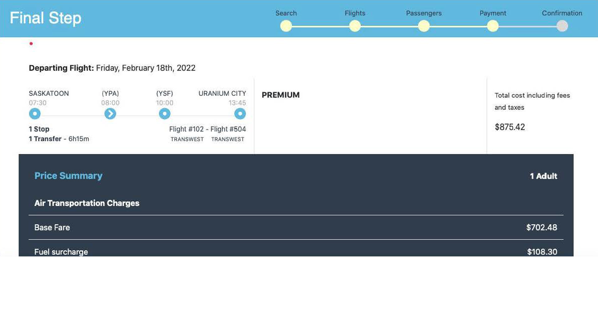
Several doubts about the information provided such as cargo/charter services, ticket segregation, accessibility language, and price summary. Forcing the users to call for additional support.
6. Inconsistent design
No keywords or hierarchy, fonts are hard to read, UI elements are not consistent, information is placed on different pages and there is no visible connection between them.
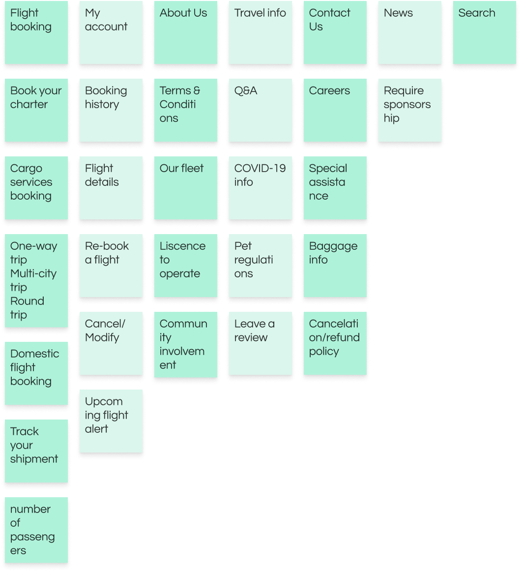
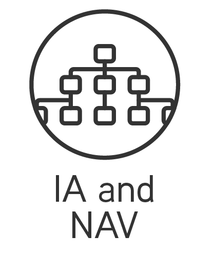
7 categories identified


First version
Low Fidelity
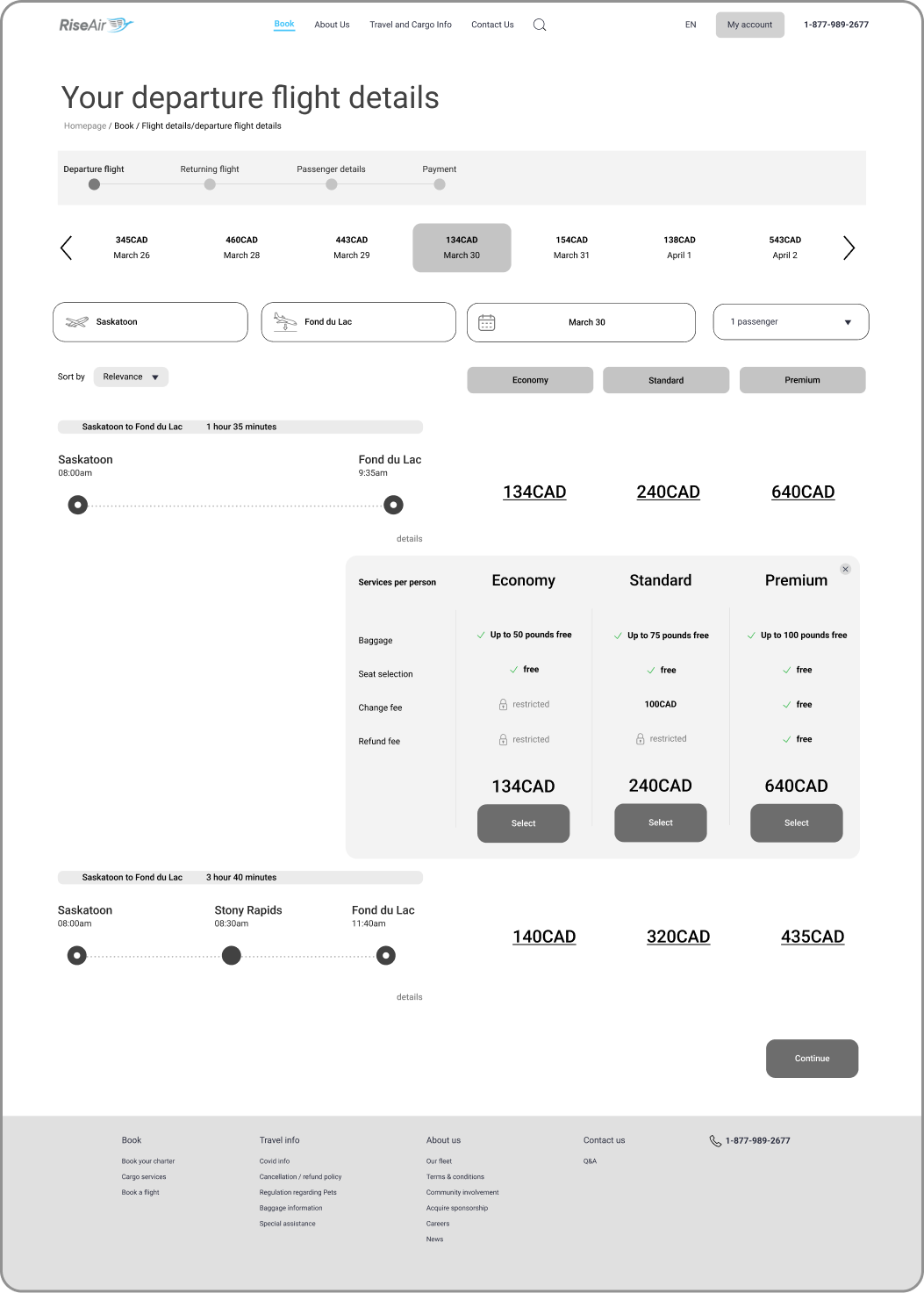
Depature Flight
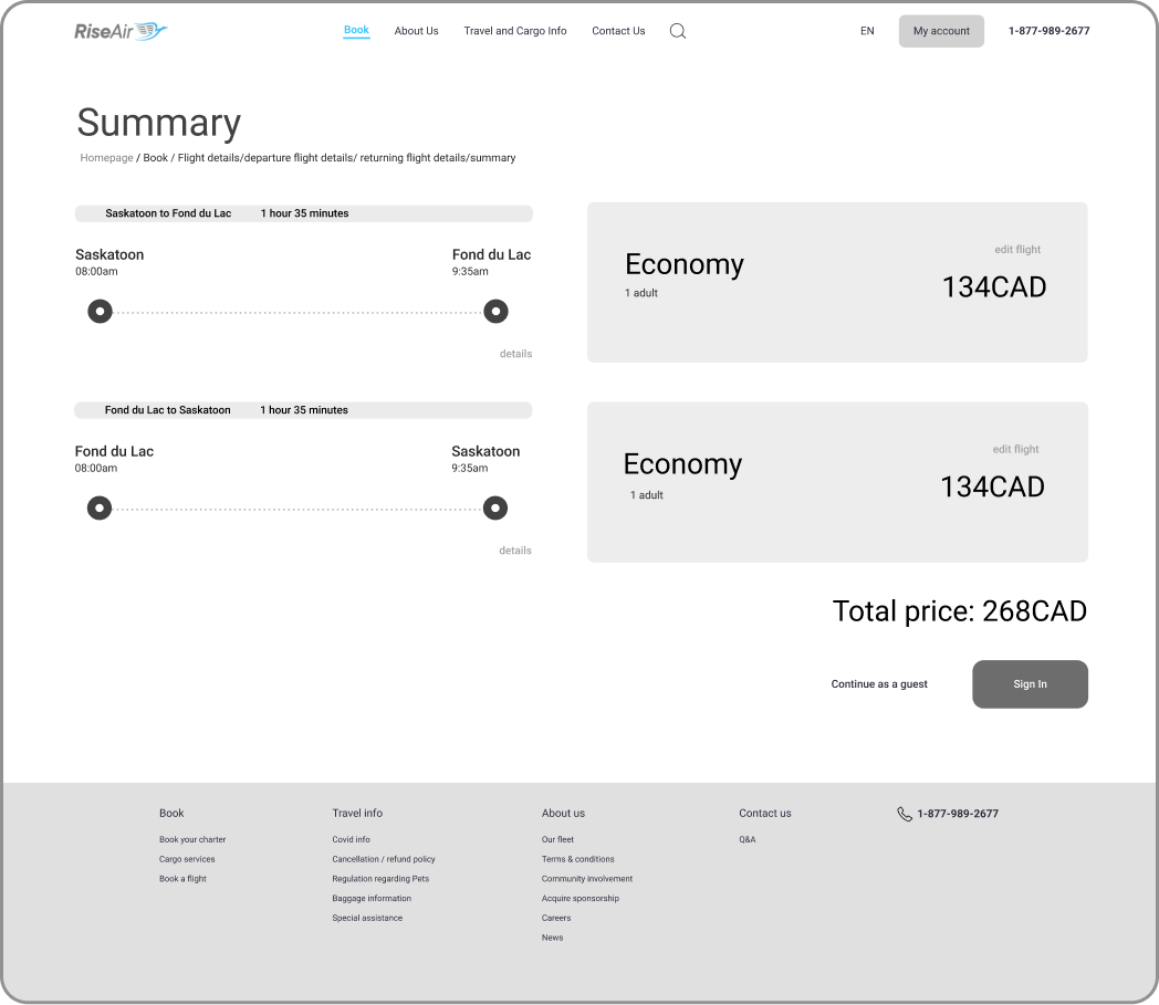
Summary
Homepage - full
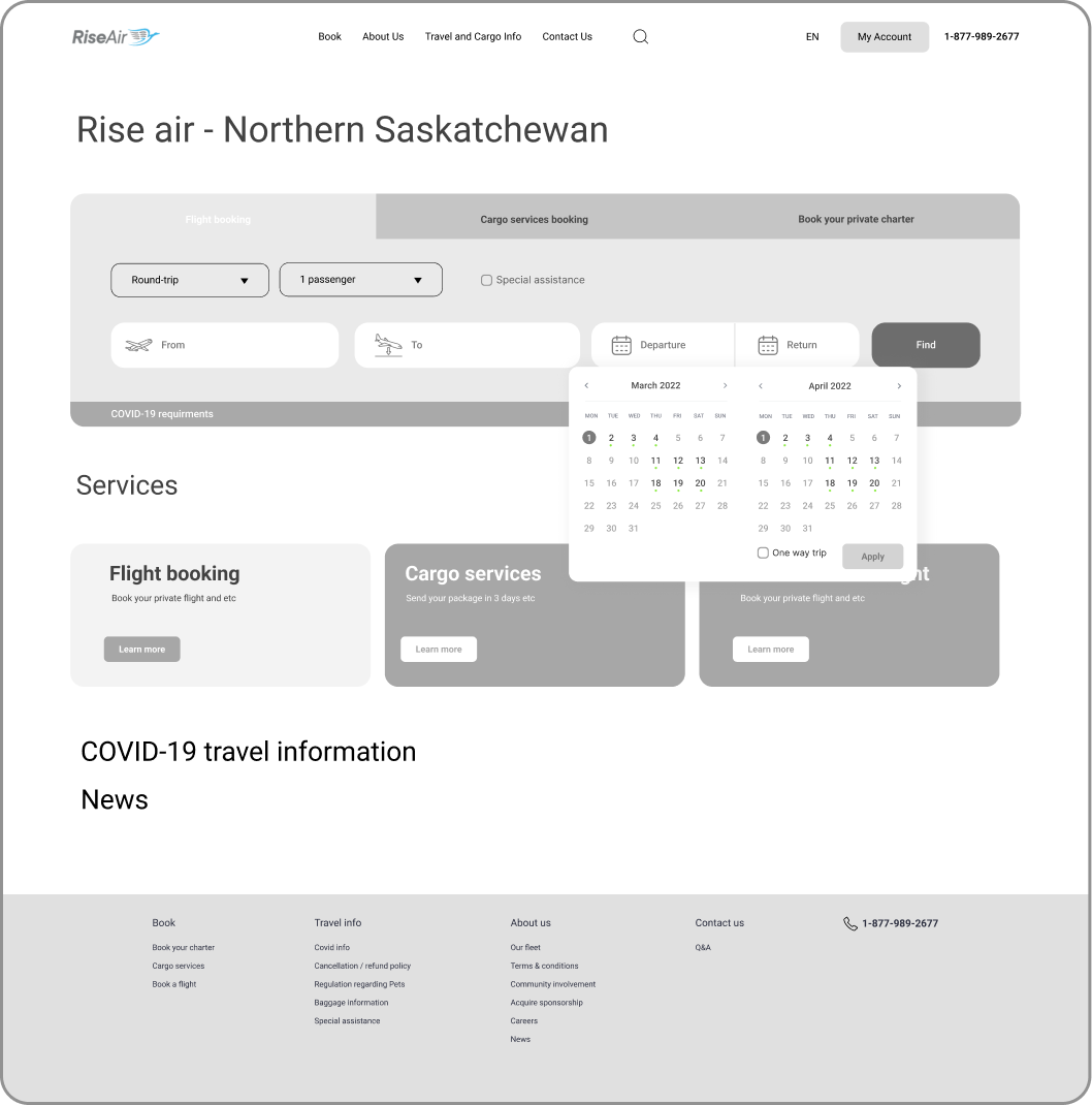
Choosing date
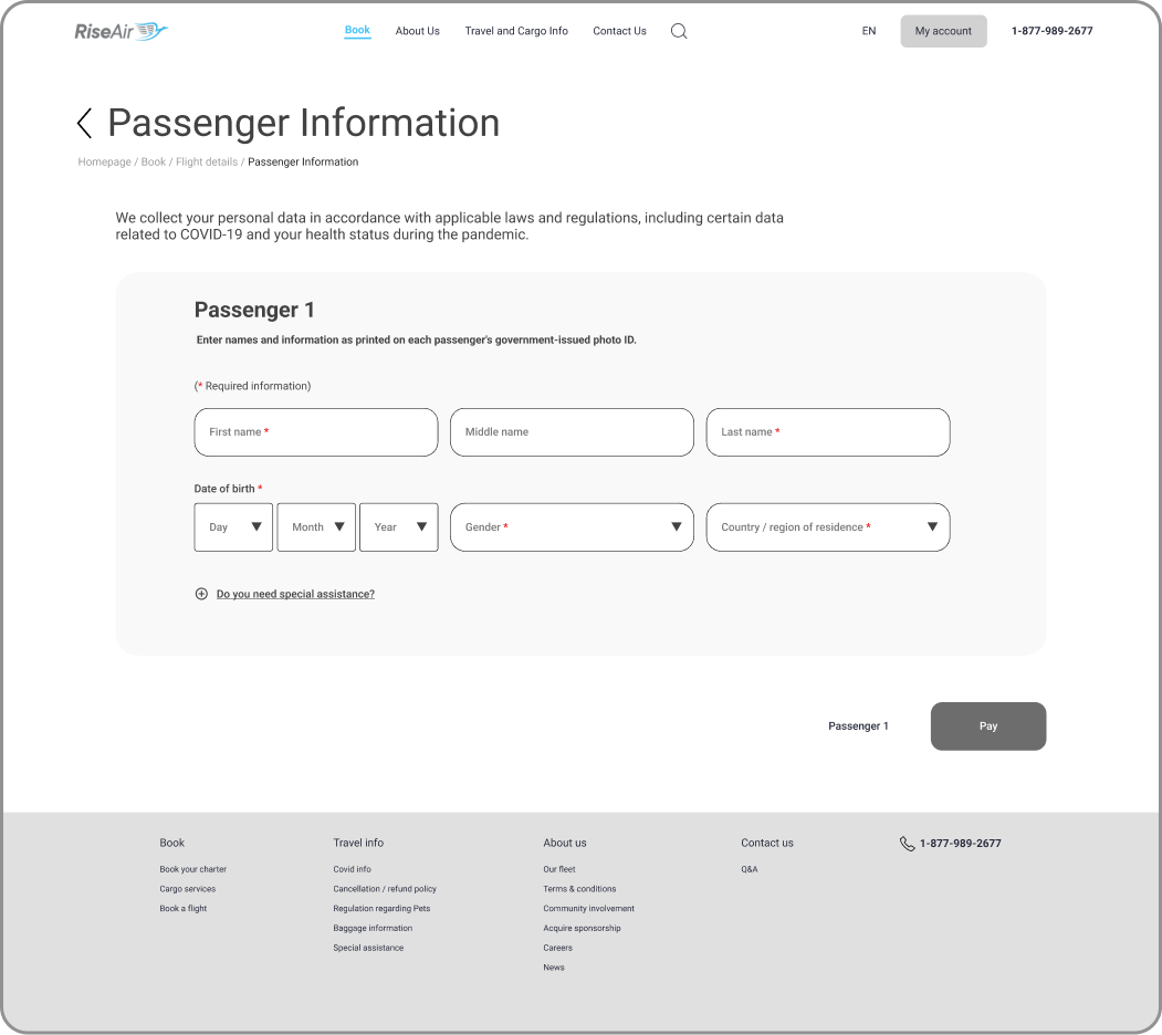
typing in personal info
Low Fidelity
Prototype Demo
Final version
High Fidelity

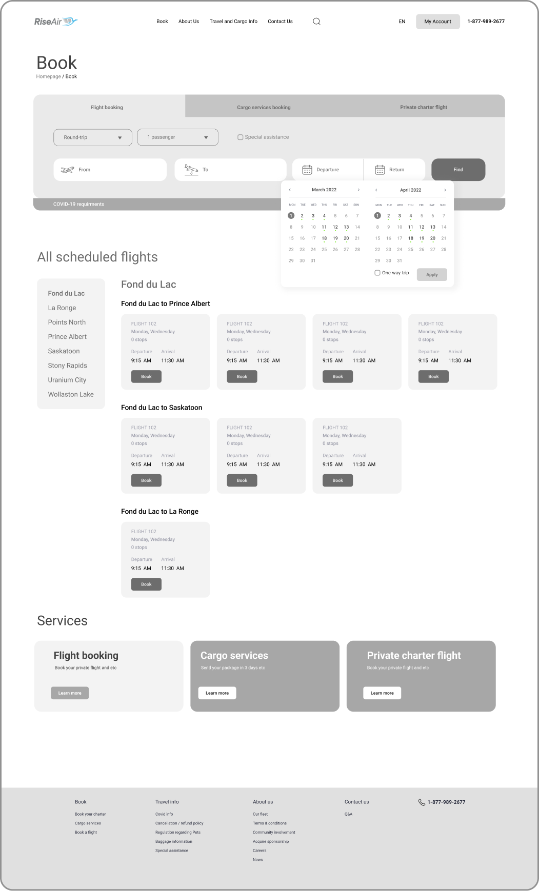
Homepage
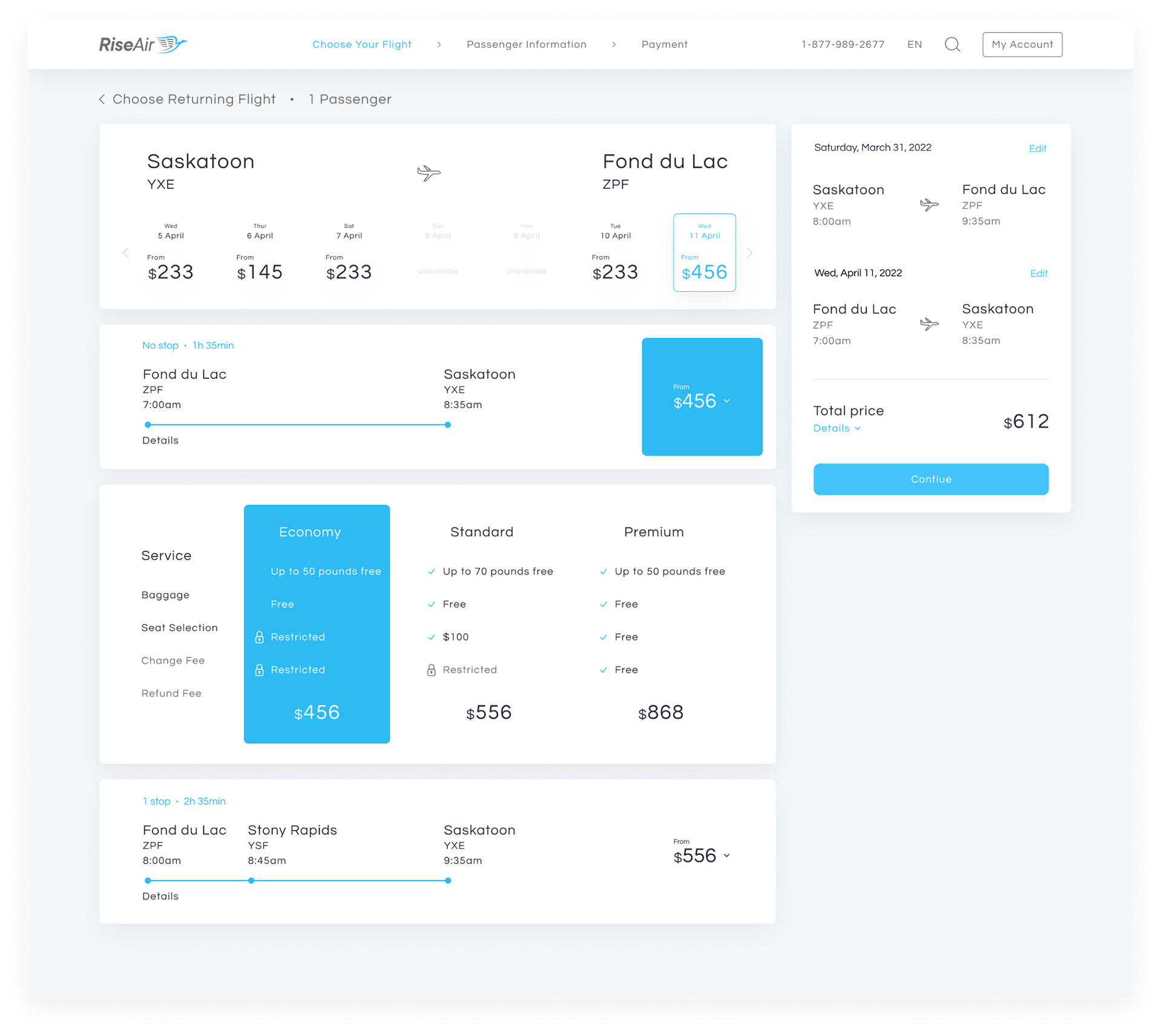
Choosing a flight

Passenger Information
High Fidelity
Prototype Demo